Have you ever just sat for minutes on end, scrolling through your phone or with your friends wondering what you should eat? Well, I would like to introduce to you, the KiChow app.
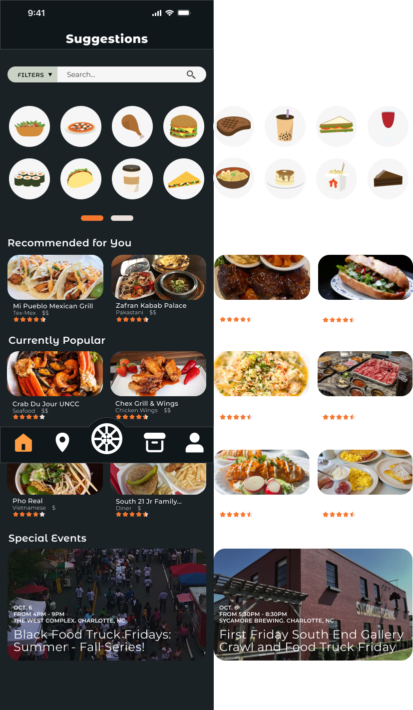
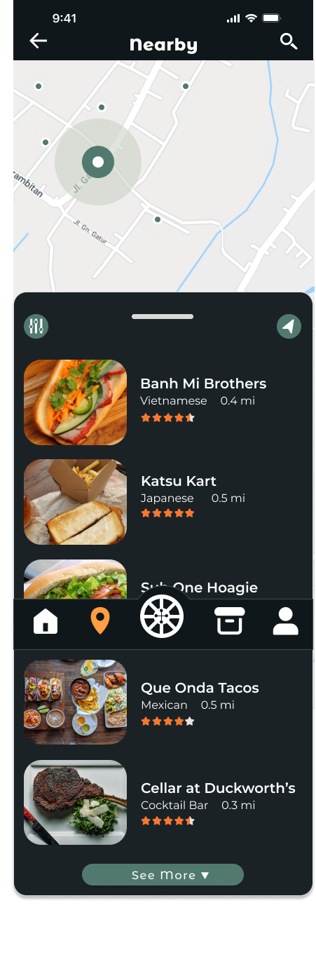
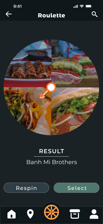
KiChow is a local food app that solves the struggle of finding local restaurants, food trucks, or pop up events and narrows down the difficult task of choosing a place to eat at. The name combines the Japanese word, 決める (kimeru) which translates to "to decide" with "chow" which is commonly associated with meals, all tying back to the brand's goal of helping you decide what to eat.
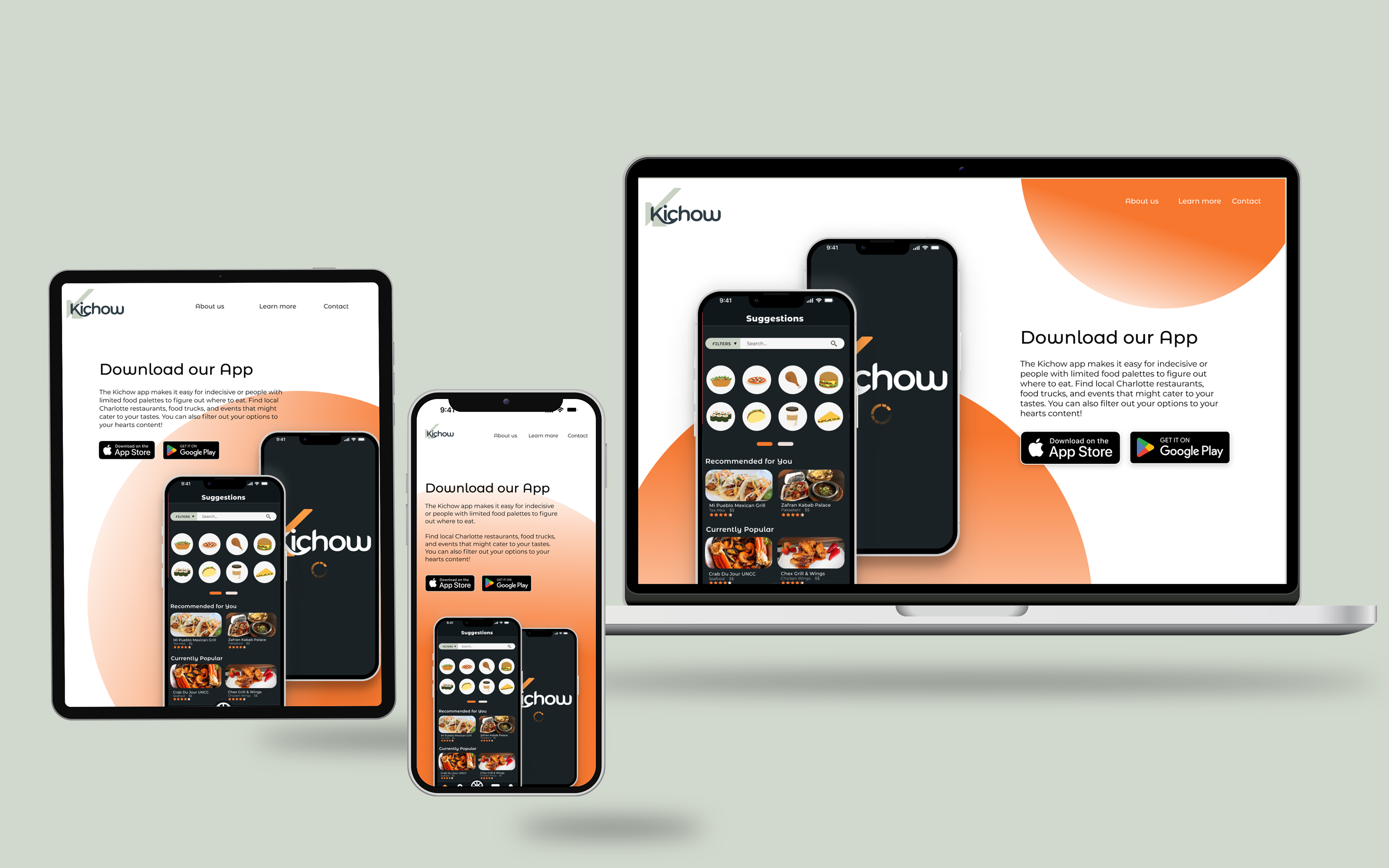
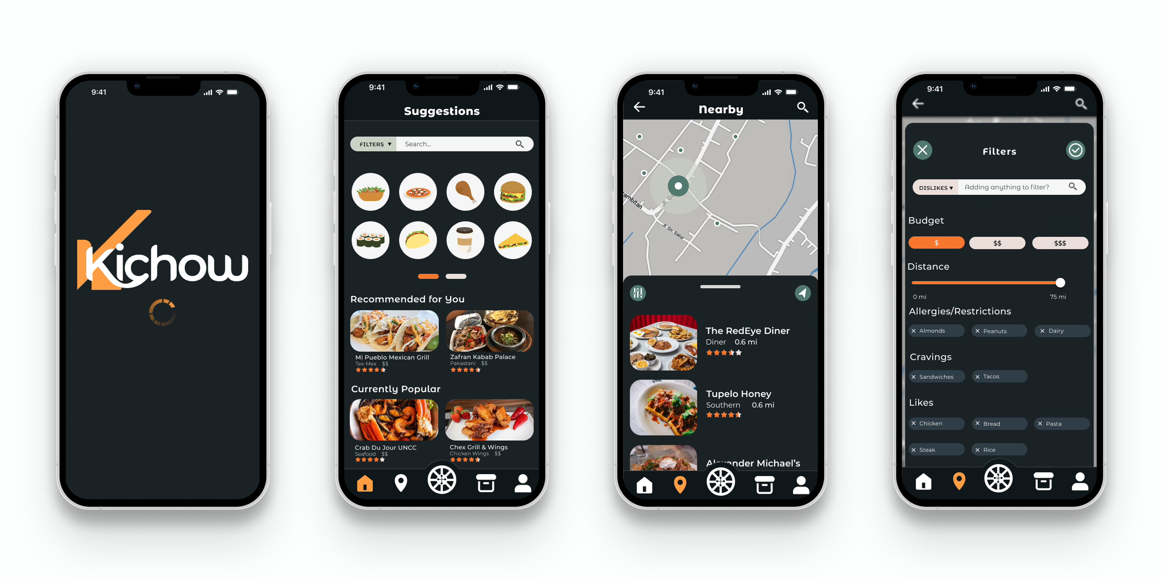
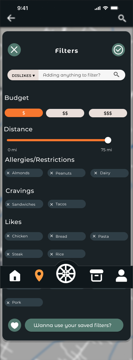
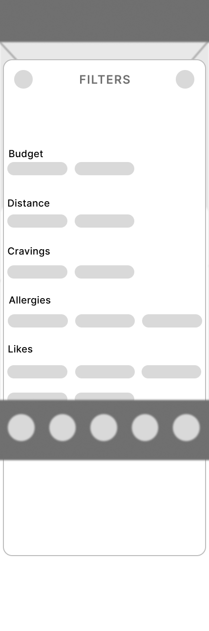
KiChow makes it easier for people with dietary restrictions or those that are indecisive to filter food their allergic to, food they dislike, or their cravings along with how far they're willing to drive and their budget. Which gives users one less thing to worry about.
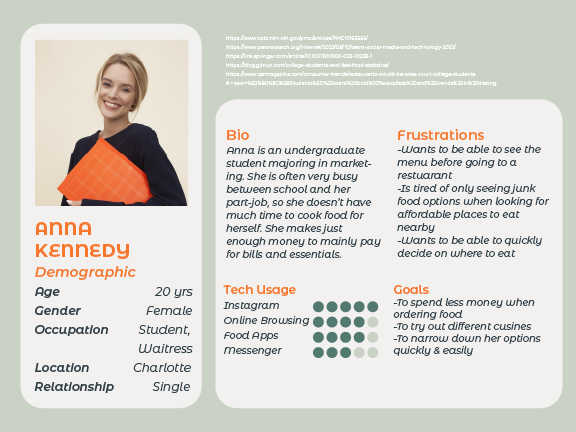
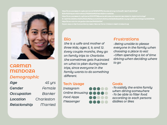
User Personas
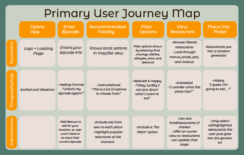
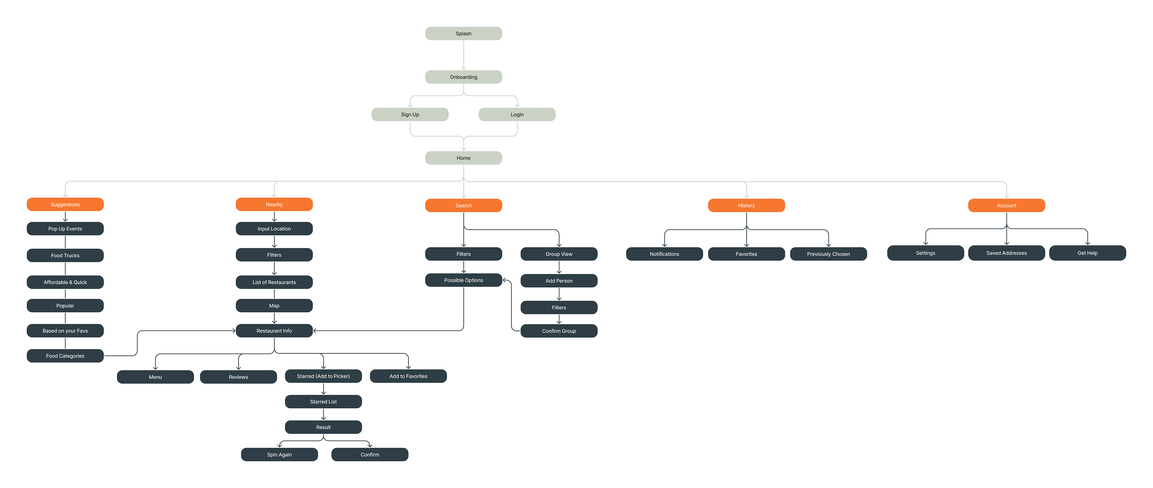
User Journey & Information Architecture
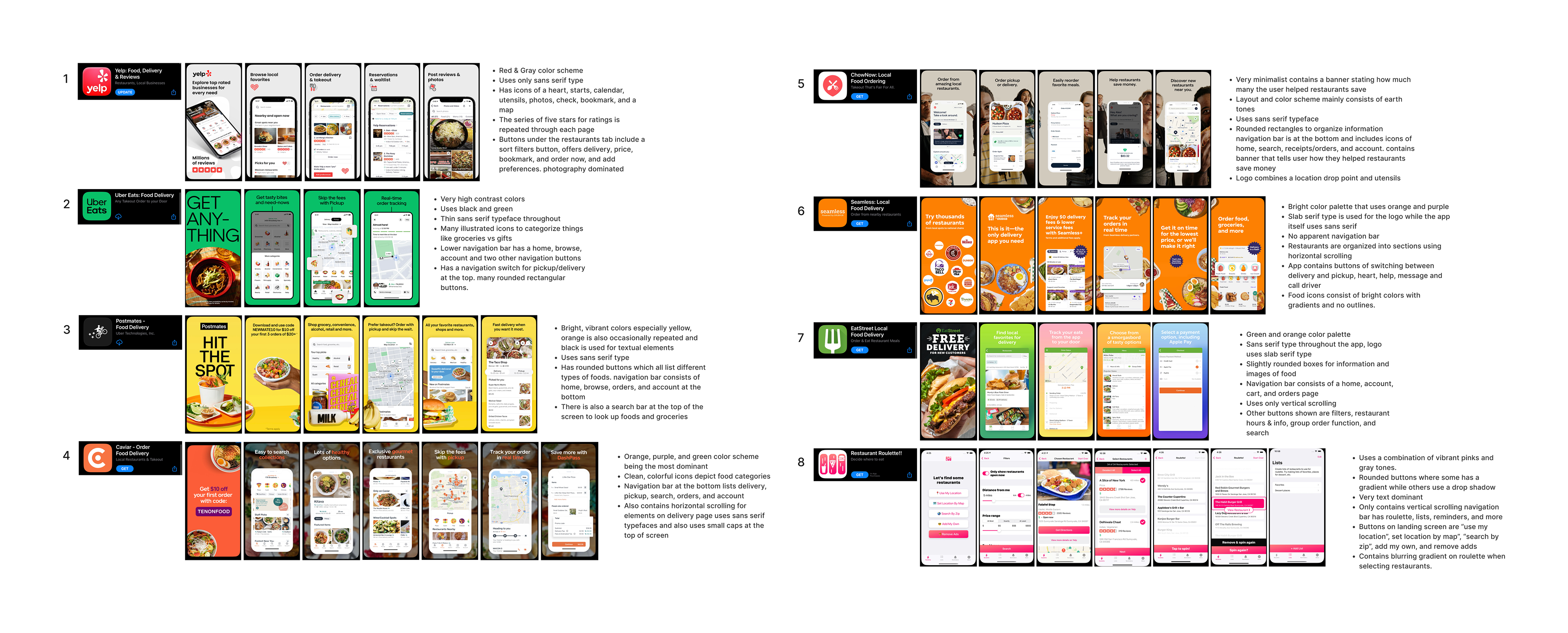
Competition Analysis
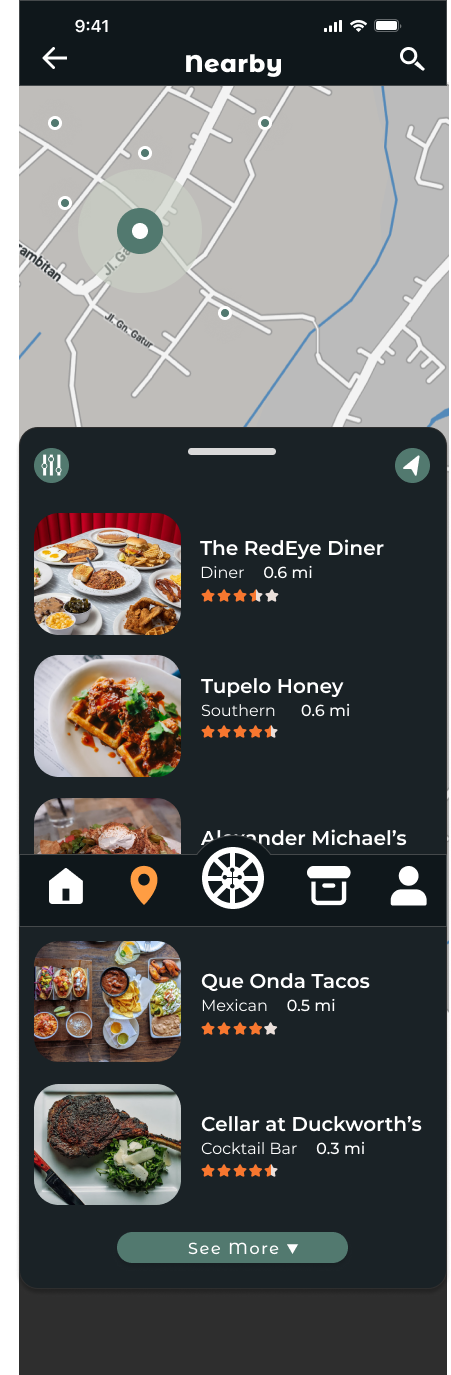
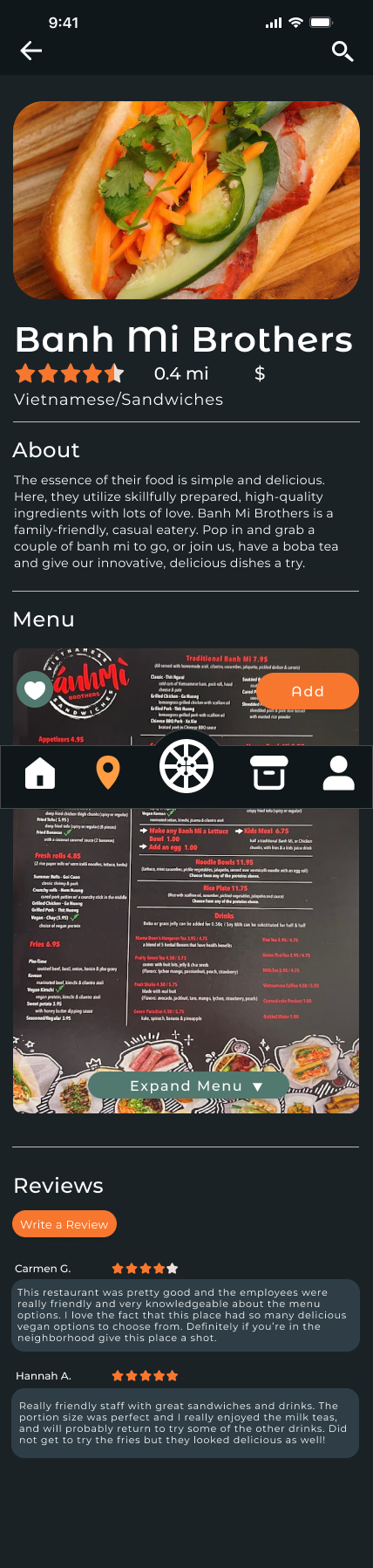
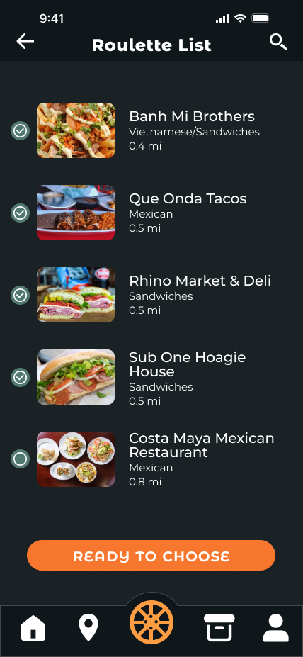
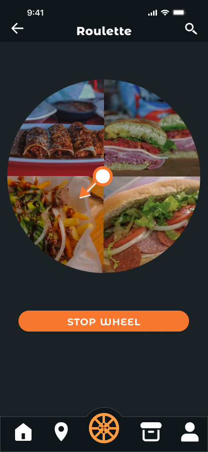
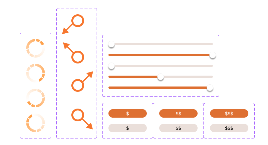
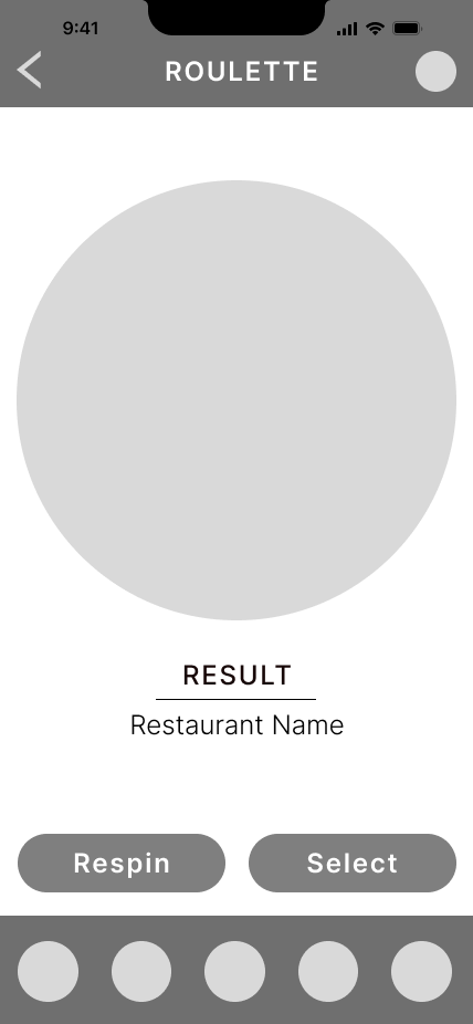
From my analysis, I concluded most apps were consistent in terms of their navigation buttons and all of them used a sans serif typeface in their design. Many incorporated sliders in regards to delivery or picking up orders, while for buttons to choose food categories were illustrated icons. Additionally, each app used rounded rectangles or circular shapes as either buttons or to organize information. Every app also had a map feature that visually depicted restaurants in the area of the user. When selecting a restaurant, each app highlighted images of food on the page. Other than restaurant roulette, there was a feature in each app to order directly from each restaurant.
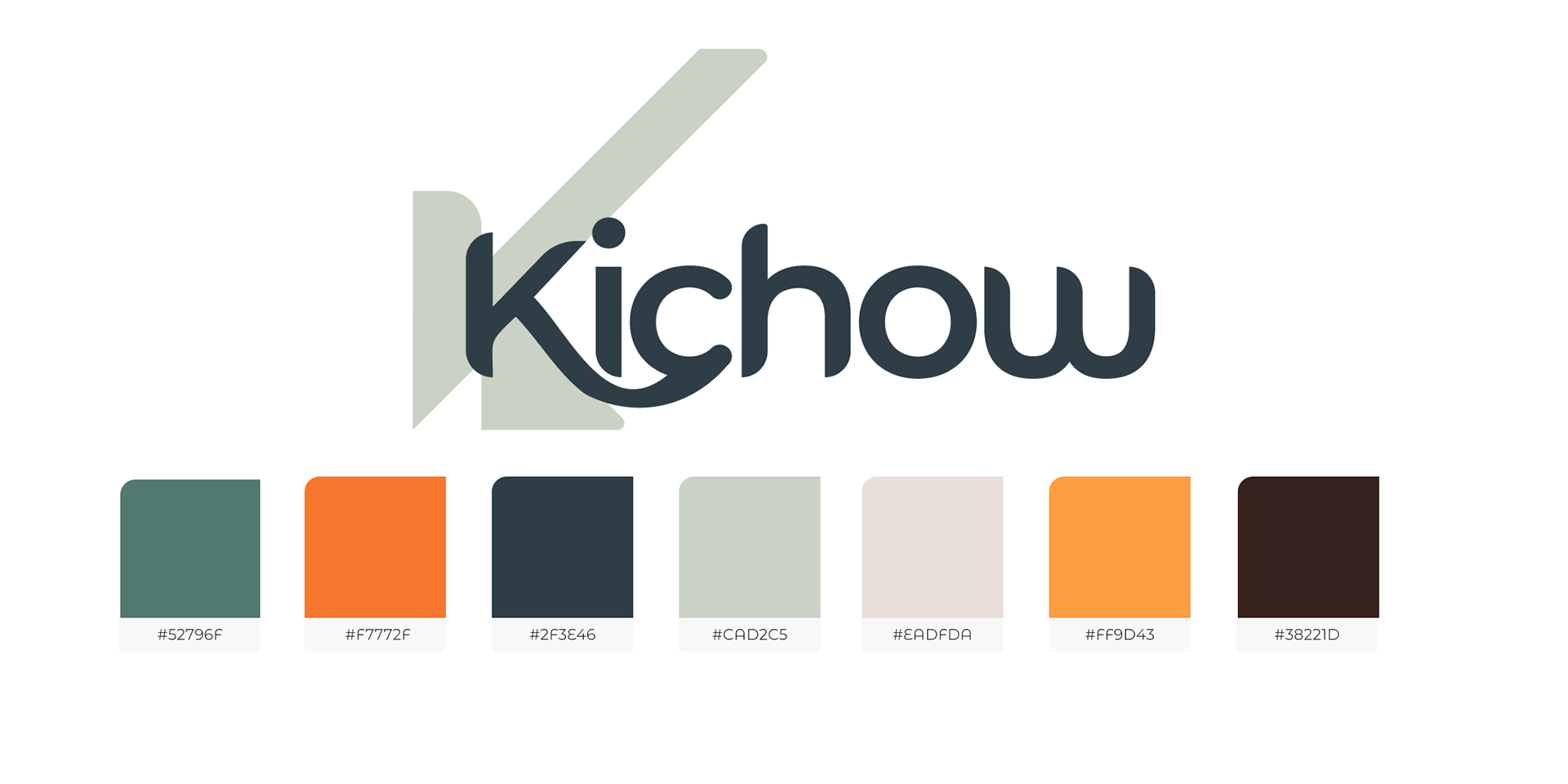
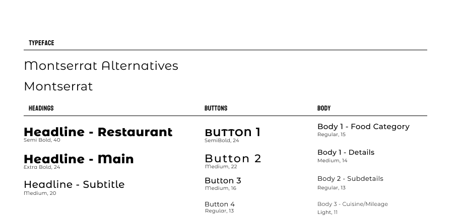
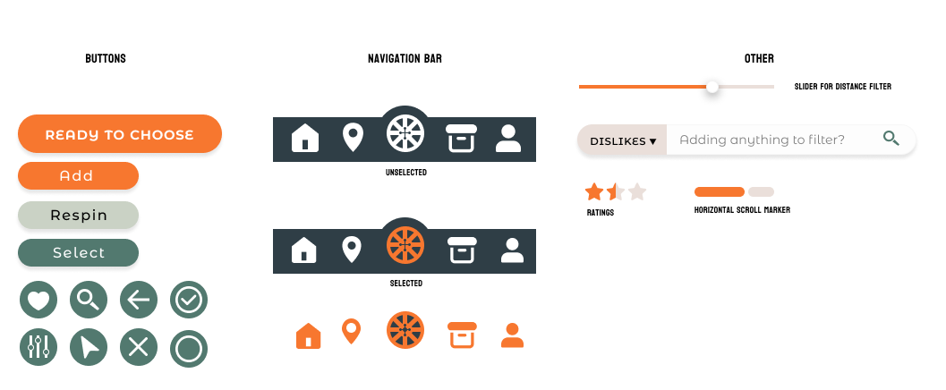
Visual Style Guide
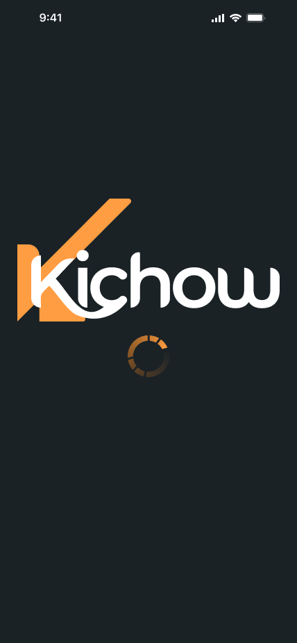
For the visual branding, I wanted to emphasize an open, welcoming feeling by incorporating many rounded shapes and edges. The symbol behind the word mark is a play on combining the letter "K" and a checkmark since the user would be checking off their goal of finding a meal to eat.

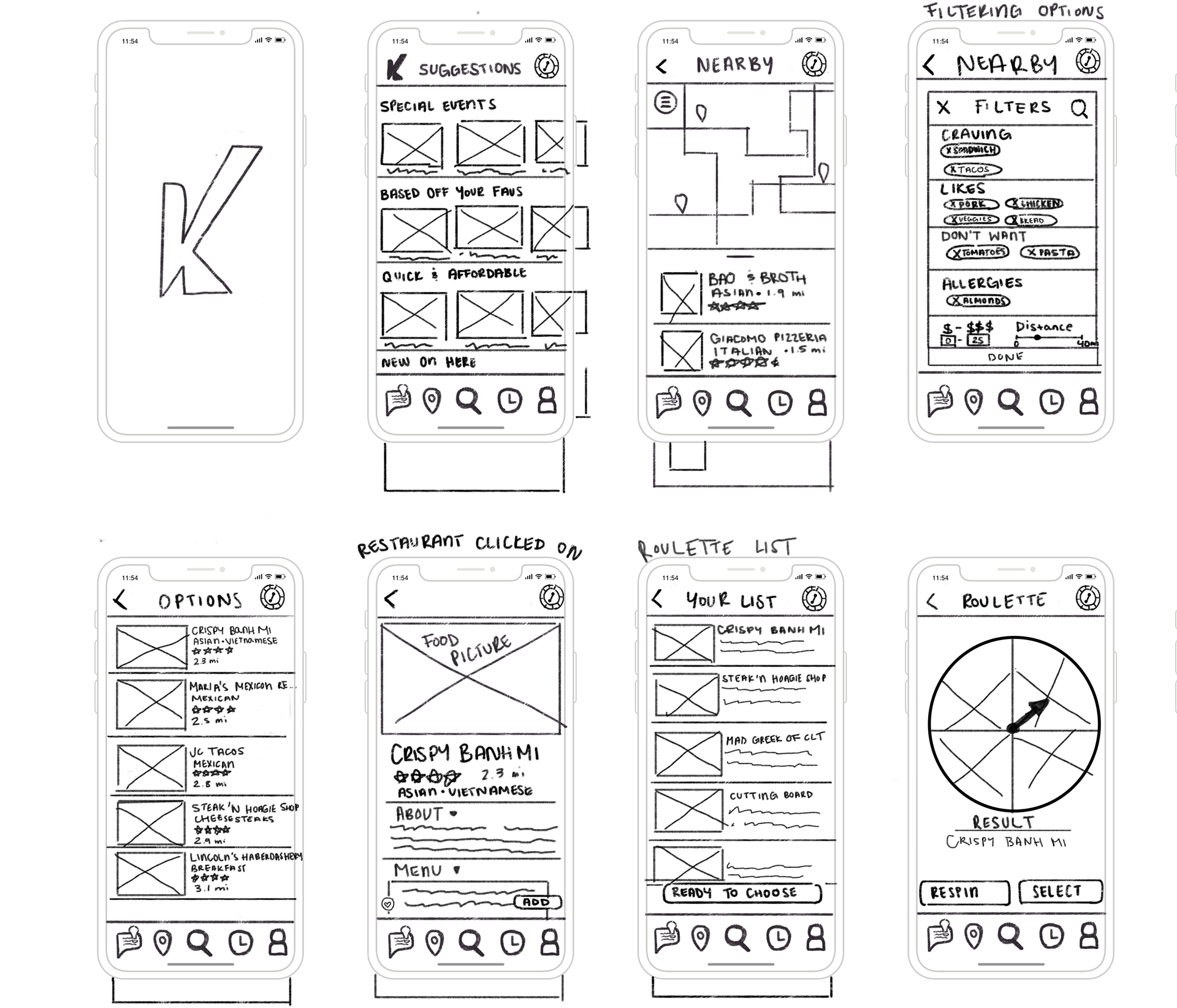
Paper Prototypes
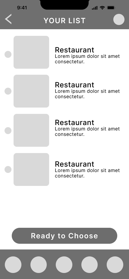
Low Fidelity Wireframes
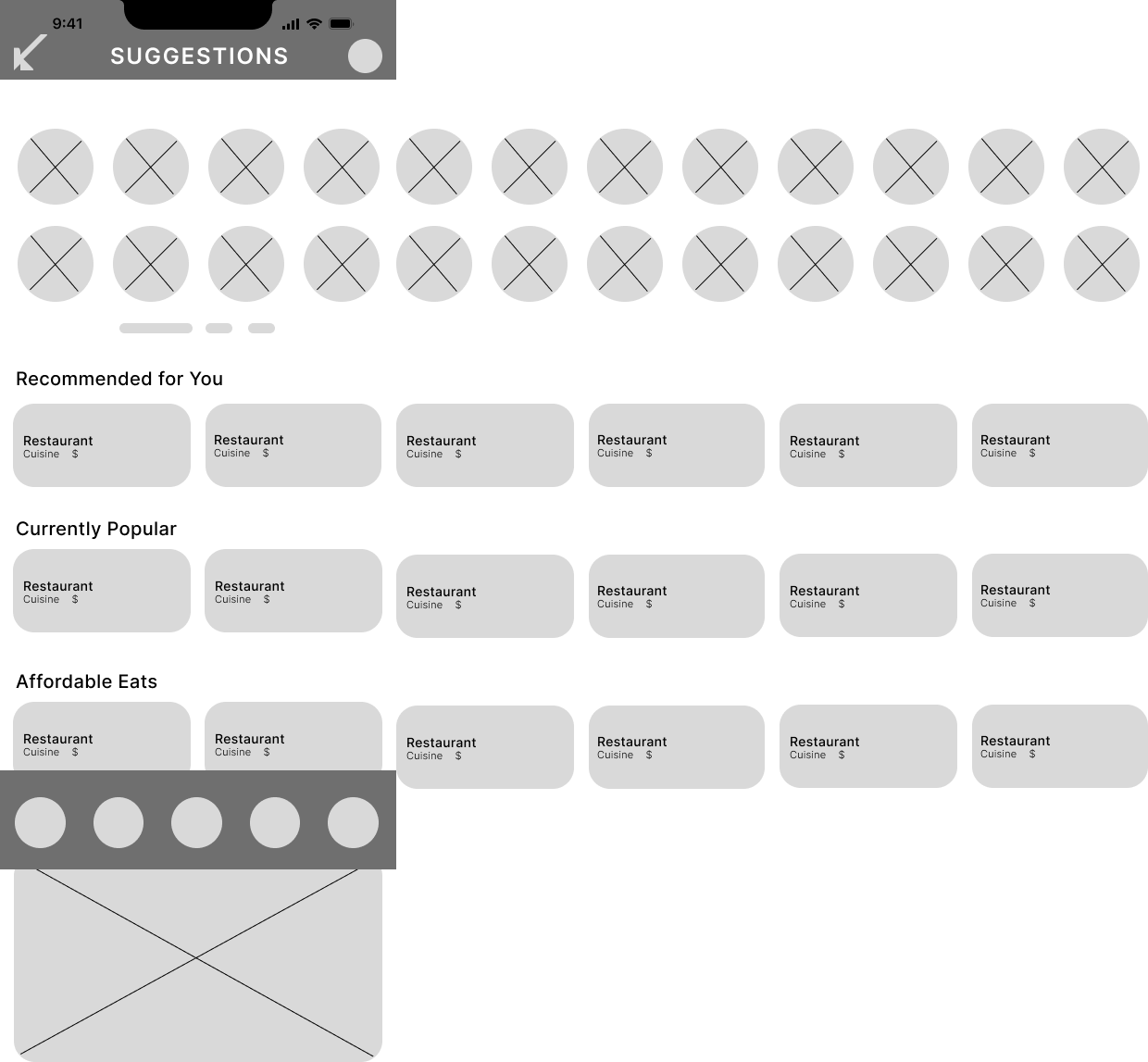
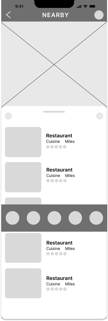


High Fidelity Wireframes